healthy. sustainable. fair
The loving earth vision was clear from the start – To build an ethically driven company where food is sacred and healthy indulgence can be good for the planet.
It gave me a solid foundation to build a strong brand that would take them from a small start-up business – from literally making chocolate in their garage to a global player in the health food space.
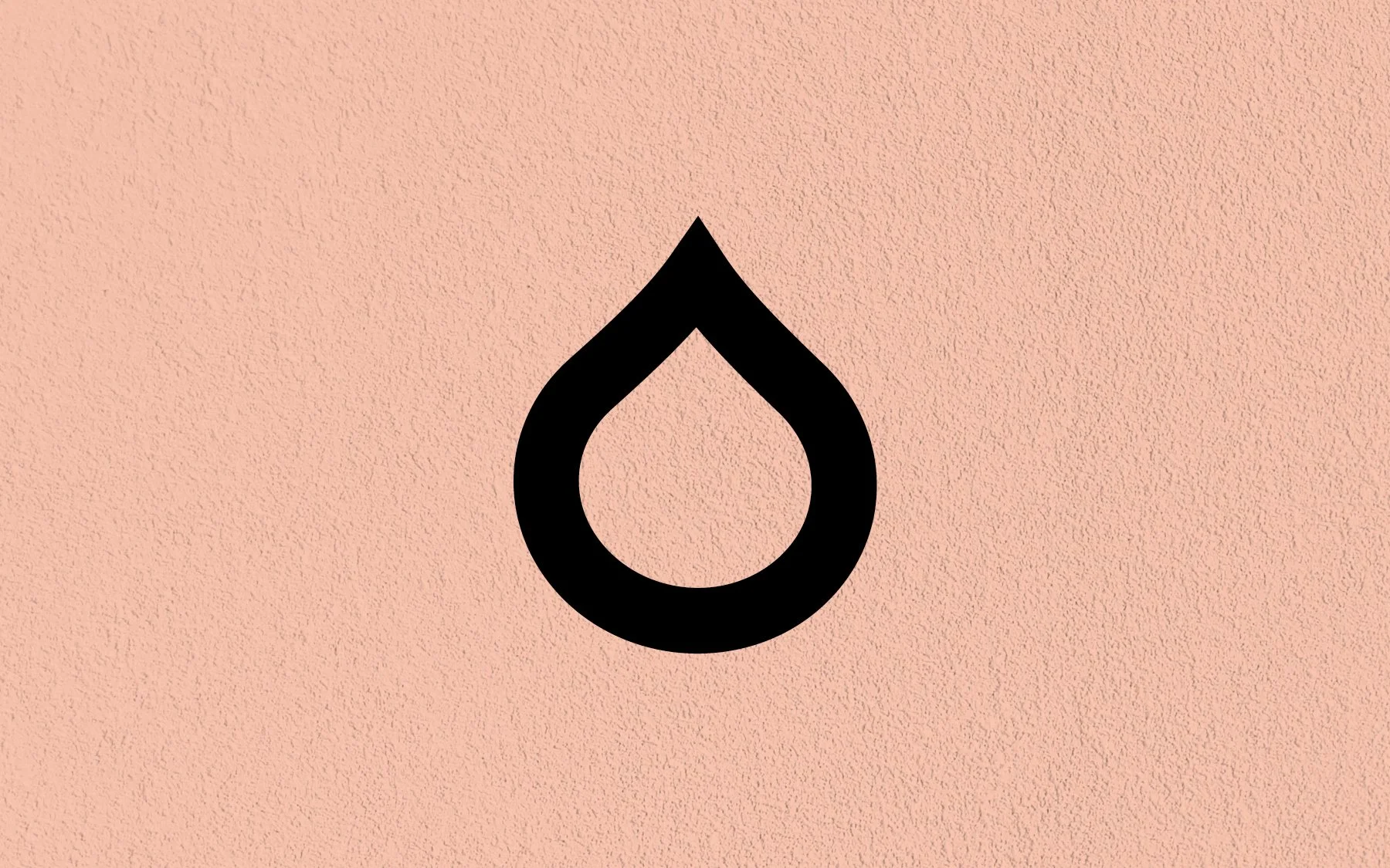
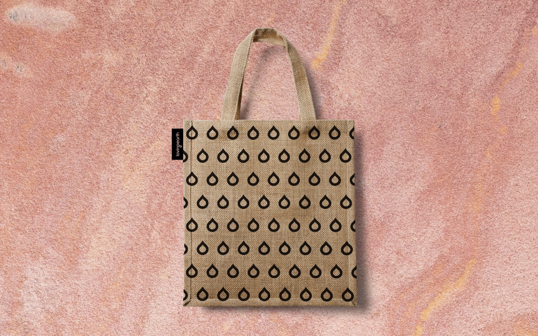
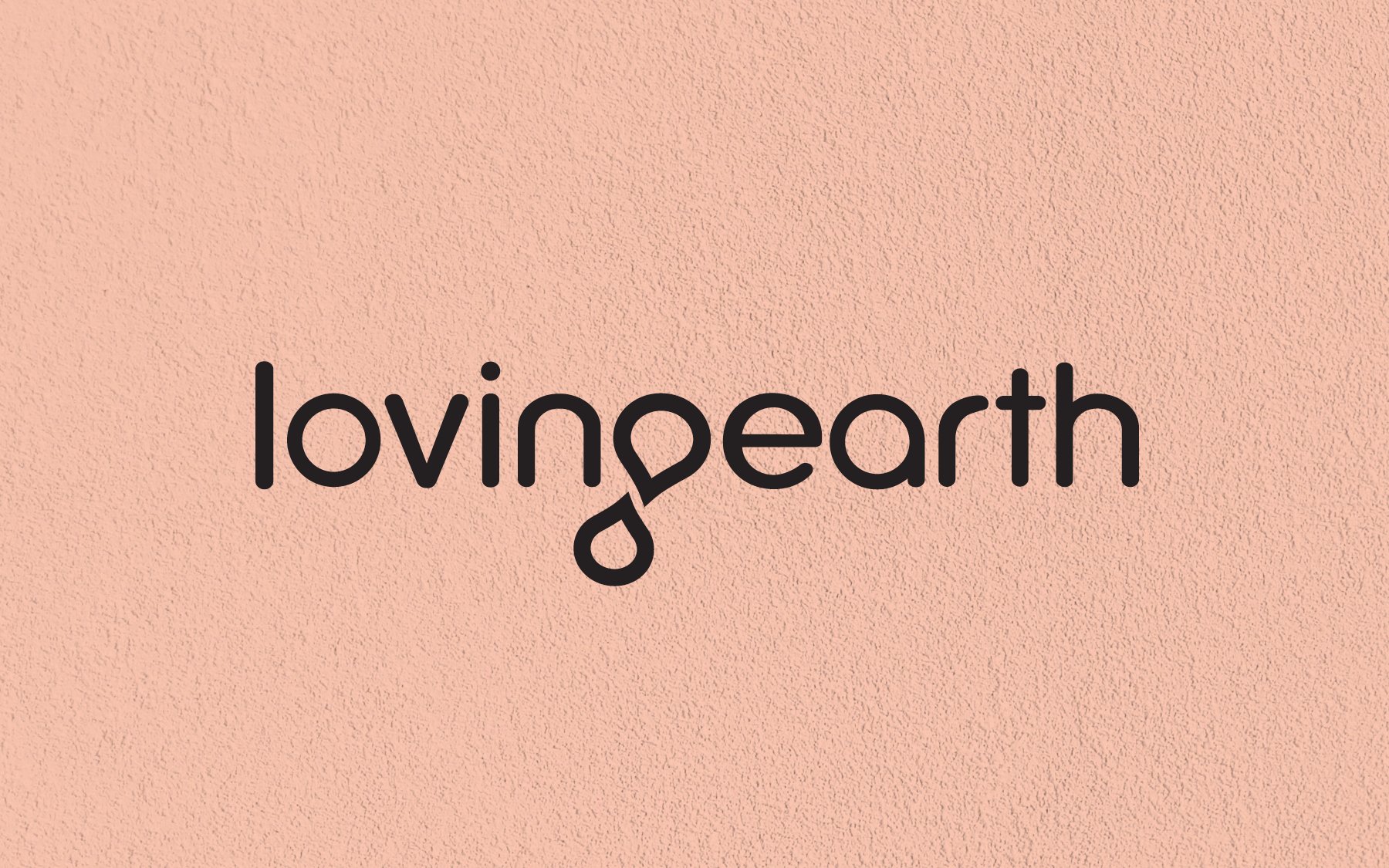
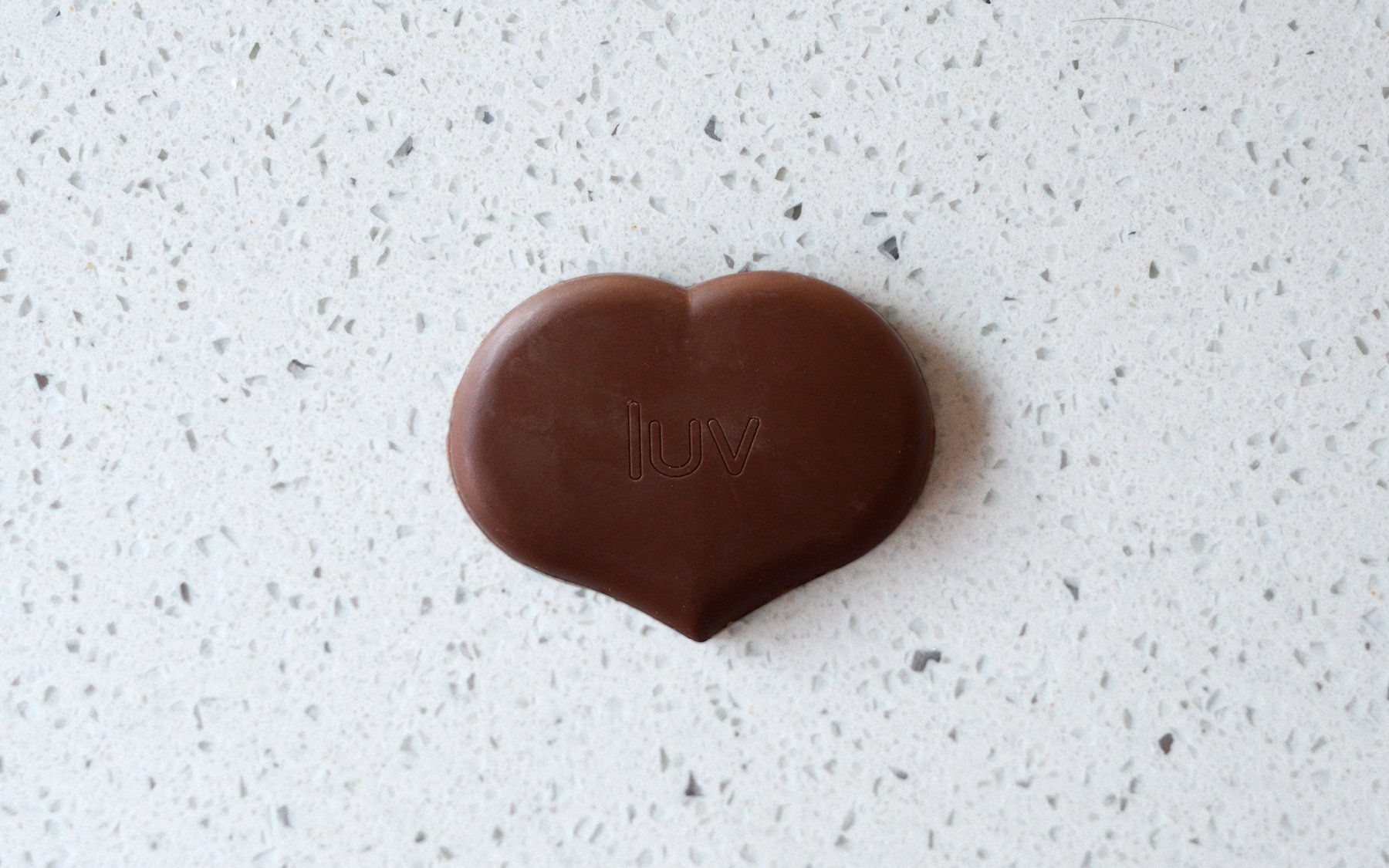
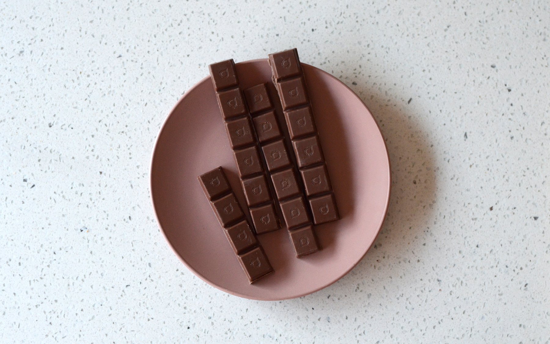
I created a bespoke typeface which included the iconic droplet, symbolising full circle sustainability and their ethically driven roots from maximising outcomes for communities and growers to sourcing sustainable packaging materials and methods. The droplet was designed to give them the flexibility to use as a single icon or to create unique patterns across packaging, marketing and digital as well as to use directly on their products, from chocolate moulds to gifting and point of sale pieces.